
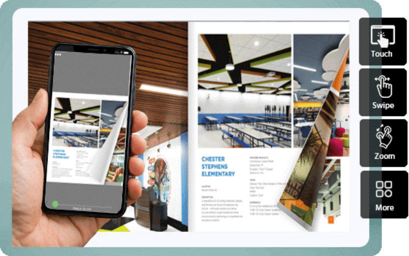
Have you ever read a traditional PDF Magazine on your smartphone? Remember I was sitting on a train last week trying to read a beautiful travel magazine on my phone? I would pinch/zoom and move my cursor sideways to read just a paragraph! I hadn’t even finished with one article before I was tired of the gorgeous photos and my thumb couldn’t go any farther. It’s that very frustrating experience that is why I’m so excited about mobile magazine design! With a dedicated digital magazine platform for mobile devices, it’s no longer a chore to read, but an absolute delight. The text reads like a dream, the pictures are vivid and come alive and everything is very intuitive.
As a publisher, creator, or simply an individual that enjoys sharing superb content, the adjustment to mobile-first design is the best option you will be able to make for your viewers. Your readers will not only continue to engage with your posts more but also get more pleasure from your text. Let me explain you why this is so amazing and how you can apply it right away!
The beauty of a digital magazine platform
Let’s now discuss the design itself. I can recall being introduced to the term “mobile-first” and saying what? Do we completely ignore desktop readers? Not at all! Mobile first is a design principle where the mobile experience is considered first, which means that the design of the page is prioritized for the mobile screen, and adapted for larger screens afterwards.
But what exactly is a mobile-first magazine design?
Imagine a regular print magazine. It is large, expansive and has tiny text columns. Simply making that smaller so it fits on the cellphone screen makes it impossible to read. Mobile-first magazine design inverts that notion!
A great digital magazine platform is responsive in design as opposed to making a rigid layout fit on a telephone. This is because the text automatically fits the width of the screen. Your large images line up neatly, and interactive videos or audio clips seamlessly fit into the flow of the article. Viewing a well-designed cell magazine is extremely satisfying! Keeping in view of the fact that today’s generation is highly dependent on their mobile phones, giving them mobile first digital magazine is indispensable in the present time.
The need to change right now!
Perhaps you’re wondering why bother altering your whole design process. Yes, absolutely! More than half of the world’s online traffic is now transmitted via mobile devices. If your magazine is hard to read on a phone you are losing out on half of your viewers.
I discovered that, when creators change to a mobile-first digital magazine system, their reader retention grows to the heavens. Your audience will be able to read your latest issue while waiting in line for coffee or in the car ride to work. The convenience factor is huge! Of course, the mobile-first platforms will also offer amazing interactive features that just aren’t possible with a print. Incorporate clickable links, pop up image galleries, and animated graphics that make your stories come alive in the most colorful way.
If you’re designing your first mobile issue, here are some suggestions to help you get started.
On one hand, if you’re feeling adventurous, these are some of my absolute favorite tips for making your mobile magazine look irresistibly delicious:
- Maintain readable font size: Avoid stylish, small, thin print face that requires squinting. Use your body text in bold, clean sans-serif font. It’s so much easier on the eye to read on a glowing screen!
- Make use of white space: Clutter is the enemy of mobile design. Leave sufficient space between the text and images. It creates a luxurious and modern feel to your magazine.
- Mobile users are great scrollers – utilize them! Make your articles flow vertically, not have to use the miniscule “next page” arrows. This seems to come across as much more natural.
- Optimize pictures: Ensure that your pictures are good quality and optimized for web. You need your digital magazine site to load very quickly, even on a cell phone connection.
Conclusion
A magazine where designers and readers can browse it from the palm of their hands is like giving your magazine a fresh breath! It’s interesting, easy to use and totally in sync with the way people are consuming content today. The smooth and intuitive experience will be loved by your readers and you will be pleased to see that your subscription rates are increasing.
Never become “old news” with your incredible content. It’s really worth playing with a specific digital magazine software that is mobile-oriented. Choose a template, experiment with interactive activities, and see your publication come alive!
A fine digital magazine platform you can try for free for 15 days is PageTurnPro digital magazine platform.

